
How does your preliminary task represent particular social groups?
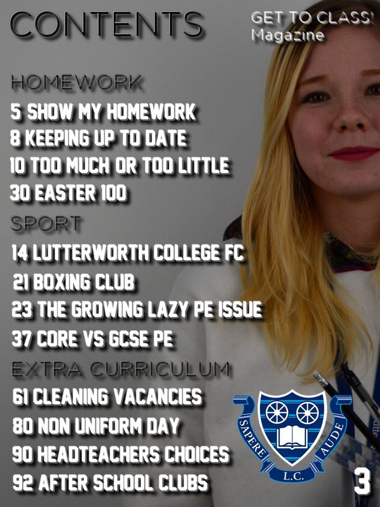
My preliminary task represents the different social groups from both a male and female teenage perspective. As my magazine was targeted for Lutterworth College and its students, its main target audience would be those who attend the school, but there is the possibility that a teacher or another member of staff could read this magazine too. Due to Lutterworth College's school colours being blue and white, I decided to interpret this into my work, by including the logo with those representation colours, and kept all of my text except for the different sections headings white. The use of white text maintains the uniform look towards the magazine, and also stands out greatly against a darker white/grey background, as I included a fading black outline around the text to make it more captivating to the eye. Throughout the cover and contents, I have used capitalization for all of the text besides the word "magazine", to show the urgency of all of the text that is spread across the two different designs. My image of a stereotypical school student represents the working student body as a whole, portraying Lutterworth College and its pupils as a very sophisticated and well organised community. The image and the entire layout of the magazine is layed out in this particular way to bring the idea of maturity and excellence to the forefront, something that Lutterworth College intend to do as a whole anyway. I have made it very obvious through the image and certain headings that my intentions for this magazine were to portray the running theme of school only, keeping it precise and informative to those who fit my target audience.
Who would be the intended audience for your product?
My intended audience that I would expect to read my magazine are teenagers aged between 14-18 who attend Lutterworth College as either GCSE or A level students. It can also be approached by teachers and other members of staff who work at Lutterworth College, but would not find it as interesting as the students due to its content. I chose this target audience range simply because I am a student from this school myself, therefore I had a great idea as to what people my age would be attracted to magazine wise if my school were to ever create their own magazine in the future. Because I attend this school, it also means I have a great background knowledge on multiple things that occur around the school, including things like after school clubs, opportunities, different subject matters etc.
How did you attract/address your audience?
I attracted my intended target audience by making sure that all of the information in both the contents and the cover page were things based upon Lutterworth College, the school in which they attend, and would find either/both useful or/and interesting to read. I have made sure to widen the audience range within the school, by including different elements like sports for all those who either play for the school or are interested, and other extra curriculum activities for those who may be interested in that too. I've also included the entire school student body as a whole by including things like homework and exam information/articles, things that every single student will have to go through at some point whilst attending Lutterworth College.
What have you learnt about technologies from the process of constructing this product?
I have learnt how to use Photoshop to a greater extent, as I have had experience in the past from using it from previous media work during GCSE, but feel like I have a better understanding of certain tools as I have grown to use it more for my A level work. Whilst before I believed that all magazines had to be completely full to be deemed as a "successful" magazine, I know longer believe this is true from looking at magazines like Clash and i-D, and have took inspiration from both in creating a lighter, and more spacial magazine layout for this task. I have also learnt a lot more about taking the "perfect" photo for the front cover, that allows the reader to become drawn to the cover with a lot more ease and feels intrigued towards what is featured there. Lighting and location are extremely crucial and key when it comes to creating a successful image and magazine overall, along with space within text so it doesn't look cramped, but not too spacial so that there are white spaces everywhere.
No comments:
Post a Comment