

This colour palette contains a mixture of stereotypical male and female colour schemes. Whilst one would think these colours should clash and look slightly odd next to each other, the cover of Clash featuring the artist Lana Del Rey proves otherwise, as it provides a dark, but also neutral aspect towards the overall image, increasing its potential attention to attract people's eye line as they walk past this magazine in the store.


This colour palette contains a mixture of light and dark colour schemes. Whilst one would think these colours should clash and look slightly odd next to each other due to their unnatural pairing, the cover of Clash featuring the artist DJ Shadow proves otherwise, as it provides a unique and stylish aspect towards the overall image, increasing its potential attention to attract people's eye line as they walk past this magazine in the store.
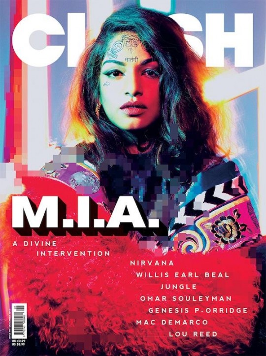

This colour palette contains a mixture of stereotypical male and female colour schemes. Whilst one would think these colours should clash and look slightly odd next to each other, the cover of Clash featuring the artist M.I.A. proves otherwise, as it provides a noisy aspect towards the overall image, increasing its potential attention to attract people's eye line as they walk past this magazine in the store.


This colour palette contains colder, more neutral tones within the different browns and greys. Whilst one would think these colours should appear rather dull and unappealing, the cover of Clash featuring the artist Matty Healy from The 1975 proves otherwise, as it creates stronger emphasis of the artist and his facial features, increasing its potential attention to attract people's eye line as they walk past this magazine in the store if they so happen to like the artist, or potentially find him attractive.


This colour palette contains tones which connotate with nature and the outdoors, within the different greens. This would attract a male audience typically as green is conventionally associated with men, and the use of the artist Earl Sweatshirt proves this to be aimed more at a male audience as well, as his overall audience appears to be portrayed as dominantly males.


This colour palette contains a mixture of both cold/neutral tones with the use of browns, alongside warm tones with the use of blues. This colour scheme provides a calm feeling towards the magazine cover, and this is also emphasised with the relaxed looking featured artist Mac Miller. I believe this would appeal to both a male and female audience, due to the use of both muted and bright colours.


The use of dark, muted tones within this cover creates a mysteriously intriguing personality towards the magazine. The different shades of green blend with the mixture of greys and blacks, creating dark connotations as a whole. This colour scheme would work well with a female audience due to the use of the cover artist Banks, alongside a male audience due to the masculine greens that are used.


This colour palette contains a mixture of both cold/neutral tones with the use of greys and blacks, alongside warmer tones with the use of blues. This colour scheme provides a thrilling feeling towards the magazine cover, and this is also emphasised with the black and white photo of featured artist Metronomy. I believe this would appeal to both a male and female audience, due to the use of both muted and brighter colours.


This colour palette contains tones which connotate with nature and the outdoors, within the different greens and browns. This would attract a male audience typically as both green and brown are conventionally associated with men, and the use of the artist Tyler The Creator proves this to be aimed more at a male audience as well, as his overall audience appears to be portrayed as dominantly males.


This colour palette contains tones which connotate with both darkness and femininity, within the different pinks and blacks. This would attract a male and female audience typically as black is conventionally associated with both genders, and pink is associated with females. The use of the artist Woodkid proves this to be aimed more at a male audience as well, as his overall audience appears to be portrayed as dominantly males.
No comments:
Post a Comment